

Option A
Full-Service
Covers & Assembly
Collaborate with our team to design the bookshelf of your dreams. You bring the books, we’ll bring the know-how. Made in NYC and custom-designed for you.
Option B
Do-It-Yourself
Covers ONLY
Collaborate with our team to design the bookshelf of your dreams. After our consultation you can scan your books into a spreadsheet and upload it for our team. In 2–3 weeks, we’ll ship you your covers. You’ll can fold and apply them yourself! Made here in NYC and custom-designed for you.
-
-
-
-
-
-
Item description
-
Paper Options
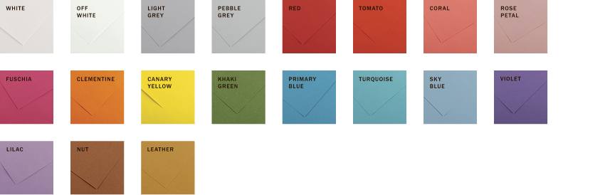
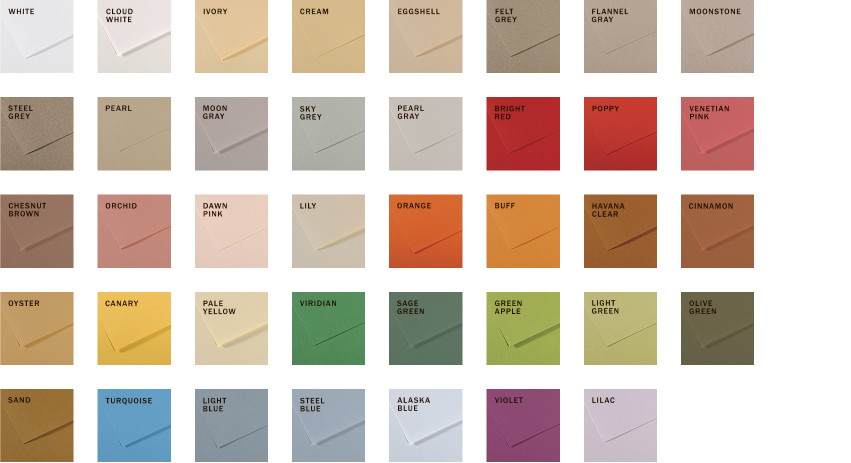
We use fine art papers from the Canson® line of art papers. There are textured papers from the Canson® Mi-Teintes® and Ingres Vidalon® lines, and smooth papers from their Colorline® range.
These papers are non-toxic, light-resistant, and acid-free. Perfect for keeping your collection looking beautiful over time.
We print in black ink. Currently, we are not able to print in light ink on dark colors.
Smooth Paper (Midweight)
Canson® Colorline®
Pulp-dyed, acid-free, smooth paper in midweight and heavyweight (see below). 92gsm.
Smooth Paper (Heavyweight)
Canson® Colorline®
Pulp-dyed, colors are light-resistant and its high cotton content makes it both robust and flexible. 300gsm.
Textured Paper (Midweight)
Ingres Vidalon®
A traditional laid texture, high-cotton art paper in a lightfast color range. Acid-free, buffered, and mold-resistant, giving you the best protection against aging. 100gsm.

Textured Paper (Midweight)
Canson® Mi-Teintes®
Pulp-dyed, light-resistant paper with a gentle texture that feels and looks luxurious. Its high cotton content makes it both robust and flexible.160gsm.
Typography

Modern
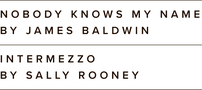
Released as Proxima Nova in 2005, as a revision and expansion of Proxima Sans. The idea was to combine the roundness of geometric sans serifs like Futura with the proportions of modern grotesques like Helvetica.

geometric
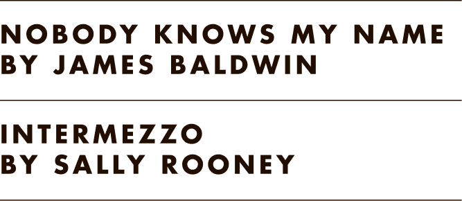
Designed by Paul Renner and released by Bauer in 1927. The groundbreaking design inspired many similar followers. Imported to US by Bauer sometime after its release, and adopted for the Intertype machine around 1930.

Classic
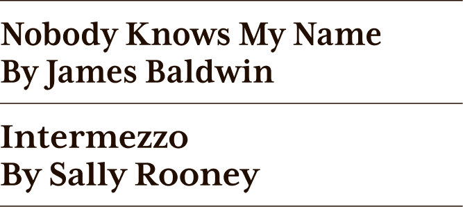
Zuzana Licko designed in 1996, Mrs Eaves after Baskerville. Mrs Eaves was named after Baskerville’s live in housekeeper, Sarah Eaves, whom he later married. There is something unique about Mrs Eaves: its individual characters are at times awkward looking and don’t seem to fit together — but, Mrs Eaves imparts a very particular feel that sets it apart and resonates with people.
Sci-Fi

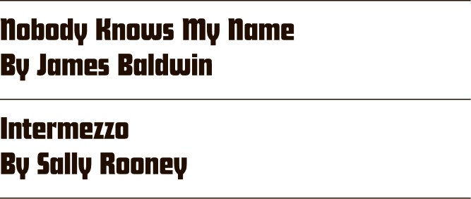
Named Futura Schlagzeile in Germany and Futura Display abroad, this is a specialized variant of the iconic geometric sans-serif typeface Futura. Designed by Paul Renner and released in 1932 by the Bauer Type Foundry. “Schlagzeile” translates to "headline", denoting its primary purpose for large-scale display use.
Roman

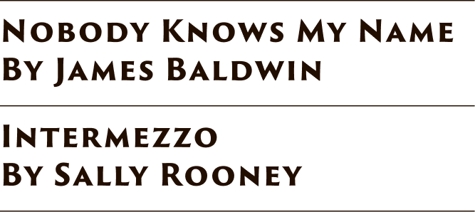
This font is based on the inscription on the base of the Trajan column in Rome, and is an example of classic Roman letterforms. It’s believed that the letters were first written with a brush, then carved into the stone. The Adobe Originals typeface, Trajan, was designed by Carol Twombly in 1989. Trajan Sans is a sans serif companion by designer Robert Slimbach.
Let’s get on the same Page
Book a 30-minute consultation with our founder, get all your questions answered, and start planning your project.